Art For Your Home – Do You Dare?
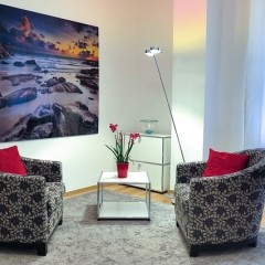
Adding intricate accents to your home décor is the best way to make your property pop out. From unusual vases, pettite coffee tables, comfy cushions and cosy blankets there are hundreds of ways to spruce up your interior design. Still, adding a dazzling piece of art as an interesting focal point is one of the best ways to make a strong statement. A blank dull wall could become your favourite place in the entire room thanks to a gorgeous oil painting. A piece of art can set (or re-set) the mood in the space making it more interesting, sometimes even more intense. However, many people shy away from investing in paintings, digital prints, sculptures and other pieces of art. Some home owners don’t consider themselves art savvy, while others are more concerned about the high prices. Bottom line being very few home owners actually muster up the confidence to make a purchase. While experts don’t advice you to buy art as a long-term investment, they do condone getting a piece for passion. Nevertheless, you need to follow a few essential tips, if you want the art to enhance your rooms and not dominate them with art. With a carefully considered piece of art, you can create a stunning focal point, an intimate conversation area or simply augment the natural flow of the space. Match the Scale of the Room A well selected piece of art neither dominates a room nor gets lost in it. To make a right choice, you need to have in mind that the proportions of the piece must match these of the rest of the space. Let’s assume you want to hang a painting above the sofa in your living room. One way to match the right scale is to look for a piece that is almost the same size as the piece of furniture below it, thus creating a sense of harmony. Sometimes, it’s hard to fall in love in a big piece of art or you just want a design that looks more out-of-the-beaten-path. In this case, you should try the “Rule of Three“. Experts apply the rule both to three-dimensional pieces and paintings as it gives a sense of scale. Instead of purchasing a single big piece of art, you can get three items with roughly the same size. You can play around with them and set them over the space a single big piece of art would take up. Moderation is the Key to Success Once you see the positive impact a carefully placed piece of art has on your home décor, you might want to add more. It’s not a...
4 Reasons to Choose Leather over Fabric
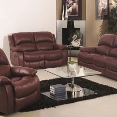
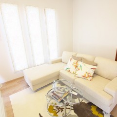
One of the most difficult decisions when it comes to buying a sofa is choosing either leather or fabric. We’ll run through 4 reasons why you’d pick leather over fabric. Durability Real leather is one of the most durable materials on the market. With proper care and maintenance, a leather sofa will last a lifetime. Most leather sofas will be treated with a clear top coat that protects the leather from water and dirt stains. Leather is made by skinning the hide of an animal. The hide is then tanned to prevent decomposition. The hide is then split into 2 pieces, known as top grain and split grain leather. If you’ve decided on leather, top grain is the best choice for durability. Split grain should only be used on low wear areas, such as the back of the sofa. The combination of top grain leather and split grain leather will save you money yet still provide you a durable leather sofa. Status Symbol Leather is typically associated with status. You’ll find leather in most offices because of this. Leather is more expensive than fabric so it’s seen as a status symbol. Another reason is that each piece of leather is completely unique, because of the markings and natural lines of the animal. In that sense it isn’t a mass produced piece and no one else will have the same leather sofa you have. Ages Well Like wine, leather only gets better with age. Leather is a natural product, so over time, leather becomes much more soft and supple. While it becomes softer over time, it’ll still retain its durability. Win win! Perfect for Families The durability of leather is great for young kids. They can spill drink and food on a leather sofa all day without damaging the sofa itself. Leather holds up much better than fabric when it comes to pets as well. Leather is durable, gets better with age, perfect for families and ages very well. Fabric also many pros, such as versatility and it’s generally cheaper. When it comes down to leather or fabric, personal preference should ultimately decide which one you...
Go Luxe for a Little: Replicating High-End Interior Design for Pennies
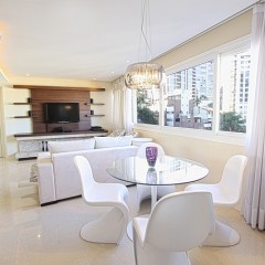
The proliferation of “real estate porn” on television and on the Internet has created a whole new subculture of amateur interior designers and house flippers. Watching some of these programs can make people feel like anyone can march into a run-down old house and turn it into the coolest space on the block armed with just a credit card and some moxie. Oh, and a few design ideas, of course. But many folks find out the hard way that their credit cards have limits, and sometimes trying to create a luxurious space in your home that feels as rich and comfortable as the professionally-done designs you see in magazines and web sites seems impossible, simply because the art, furniture, and other design elements used are so expensive. Don’t despair though. One of the dirty little secrets of the design world is that you can almost always duplicate a look using much more affordable pieces. It just takes a good eye and some patience. Cautionary Note That said, here’s a note of caution: Replacing a couch that costs $5,000 with one that costs $500 may get you the look you want if they’re similar in colour, texture, and design. But the extra costs of luxe items is not always just in their design and rarity: Often it reflects craftsmanship. Don’t be surprised if your cheaper couch simply doesn’t wear well, or isn’t as comfortable. We’re discussing here the superficial look of your space, not necessarily getting equal quality. Which isn’t to say that you can’t get great looks and quality for a good price – you can. Just keep in mind that sometimes you get what you pay for! Mimic Luxury The key thing to keep in mind when trying to create a luxury look for pennies on the dollar is that design, like fashion, trickles down. What this means in practice is that if you spot an amazing dining room table in a showroom at a fancy store that costs big bucks and just came out, you’re likely not going to find something like it in a cheaper store right away. It takes a little time for the lower-end stores to, well, copy it. You’re always going to have to be six months to a year behind the trends – but unless you plan to redecorate your home twice a year, that dining room table will serve you and your family for years to come, so a slight delay on trends shouldn’t be a concern. Line up your resources. You need two lists: High end stores, web sites, and designers where you can see the spectacular and expensive goodies the...
7 Ways to Get Most Out of Your Dining Room
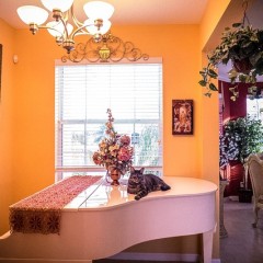
A dining room can be one of the most difficult places to decorate in a house. The same old formula applies with little to no room for improvement. But being innovative and shaking things up to maximize the benefits of that formula is a trick only few have mastered. There are a couple ways you can get the most out of your dining room and make it look good as well. Room appropriate furniture: The most important thing to remember is that the size of your room determines your furniture. If your room is small you need to make it so it appears larger and cozy. If it is big then you can utilize more space and design it accordingly. The size of the furniture should be in respect to your room so that your room doesn’t appear too congested or empty etc. Cabinets and shelves: Depending on the size of the room, you should utilize it. Even if it is a small room, only having a dining table and chairs is madness. You need to be able to decorate your fancy silver ware and collection of books etc. having a corner cabinet or two will utilize the corners for a good cause and not take up much space either. In a larger room, you could have a book shelf set up on one side of the room and display all your literary interests etc. Angle in extra chairs: As you know most people just stack their extra chairs on one side. You can utilize the room and maximize the benefits by placing them at strategic angles that don’t take up much space and are not a bother either. For example, a corner of the room etc. this will be a great way to avoid shortening the walking space and being out of the way until needed. Storage space and contemporary bar: Get drawers made directly underneath the table. That way you can store the necessary things needed there and not have to search for them at the time when they are needed. You could also set up a secretary desk at the corner of room and store all necessary things, dining or otherwise, in the drawers as well deck up your fancy silverware and crockery etc. You could also set up a contemporary bar so that you don’t have to keep revisiting the kitchen for refills etc. Buffet and cumbersome cabinets: Buffet and cumbersome cabinets are a real important part of a dining room. You can store all the dining things required there and decorate the top with fancy décor pieces etc. If a party ensues you can...
Australian Designer Natasha Dumais on Keeping Kids’ Spaces Stylish
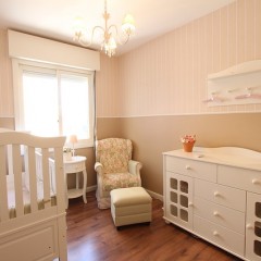
Australian furniture designer Natasha Dumais gives exclusive tips on how to keep a kid’s room stylish and organised. Only on Best Home Ideas! When I fell pregnant with my first bub some eight years ago, I scoured baby furniture shops and was incredibly disappointed. Everything looked mass produced; cots were all a variation of the same theme. As a designer my passion is making my world, and my home, look stylish. So after the birth of our first baby, my husband and I set about making our own modern furniture brand – now known as Ubabub. Over our years of creating furniture and designing our own daughters’ rooms, we have collected some useful tips for preparing your nursery space and kids’ rooms. Begin by collecting some room inspiration. Luckily with the Internet and the magic of Pinterest there are plenty of resources online for this: Find a hero piece – a product or furniture piece you love. Like a cot, a beautiful pendant or bunting, a chair or a piece of art and build your room around this one item. What this will do is define a beginning for your interior colour palette and sometimes it may even set the tone for a theme –‘earthly colours’, for example, with bright pops of colour. In our older girls’ room our colour scheme was inspired by a decorative garland we’d bought from Confetti System. And for our little one’s nursery we took our colour palette from the Sundae Wall Art that is a huge feature in the room. Think practical and don’t let aesthetics stand in the way of coming up with a functional room design. For example will the nursing chair be comfortable to sit upright in and feed your baby? A soft rug or carpet under foot could be ideal for baby to lie on the floor and play perhaps? Are the material surfaces you’re using able to be wiped clean or washable? In our older girls’ room we use the Booksee book shelves which hold our girls’ favourite books whilst doubling as a beautiful and bright wall feature; and we have a wire and peg system for hanging up the girls’ own artwork. Storage is vital when bubs and kids are involved! They trap a lot of parents fall into is not having enough dedicated places to store various kids’ items. If you’ve ever walked into someone’s home and seen Dora the Explorer or Bob the Builder merchandise as far as the eye can see, you know what I am talking about. Define storage areas and let your children know these are the specific homes for their dress ups,...
Go Big or Go Small: Small Space Design Tips
The housing world is in flux as the decades-old trend towards larger and larger homes worldwide begins a slow, majestic adjustment back towards smaller and more manageable homes. This is combined with a return to urban areas after decades of movement to the suburbs, and has resulted in people rediscovering the charm – and affordability – of smaller spaces. This has also led to the rediscovery of the challenge of decorating and furnishing a small space. Going from a huge swath of real estate complete with ill-defined ‘bonus room’ in which to store all your junk to a place that has about 100 square feet per person can be difficult – but there are some simple concepts to keep in mind. Go Vertical Space becomes very literal: Every square inch of three-dimensional space has to be used if you want to make a small space really work. Instead of concentrating on floor space, look up and think of ways to use wall space and ceiling space. In a small space, stuff on the floors tends to clutter up walk ways and make rooms feel crowded. By getting things up off the floor, you make the room feel lighter and larger. Some ideas for going up: In the kitchen, pots and pans can be hung from hooks in the ceiling, and knives and other implements can be stuck to a magnetic holder mounted on the wall. In the bedrooms, wall shelves can wrap all the way around to supply a tremendous amount of storage without cluttering the floors. In the closets, multi-hangers that hang two or even three things in the same vertical space are a must, because they transform your barely-a-walk-in into more space than you need. Expose Everything We have a tendency to close a space. We like putting doors on our cabinets and other storage because they hide a multitude of sins, but when you have a small space closed-off storage chokes a space and makes it feel even smaller. This is because the eye moves about and all it sees is closed-off spaces, accentuating the tininess of the overall home. Instead, take the doors off. It requires a bit more discipline because you have to keep the shelves and cabinets neat and tidy at all times, but it conveys an open feel that can combat the closed-in sensation that a lot of small rooms and wall scan leave you with. In the kitchen, cabinets become shelving units, with colourful plates and glassware providing the decorative touches. In the office, book spines create a mosaic of texture that livens up the room without the addition of anything...


