Designing the rooms in your home basically all comes down to four basic elements: the floors, the furniture, the walls, and the ceiling-slash-lighting.
While all of these elements have to be brought into harmony, no one said that harmony has to be obvious. Sometimes, rooms that seem like they could never work when you first walk in eventually become your favourite ones as your brain slowly uncovers the hidden connections between every design aspect, and the plan is revealed.
That’s no easy task. However, when successfully implemented these subtle connections can be awe-inspiring. One way of achieving this sort of effect is to think about your wall art a little differently: especially when you have to differentiate between the intimate and personal and the stylish and stock.
The Stock/Story Divide
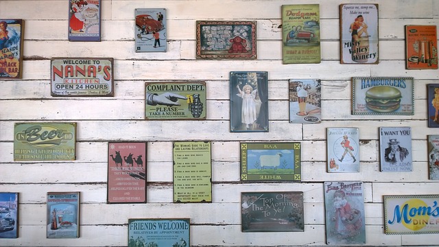
All art can be divided into two very broad categories – personal, which tells a story and depicts you or your loved ones. Even places and things that are close to you. They represent your experiences and affections. Then there are stock pieces of art. These may be beautiful and stylish but don’t necessarily relate specifically to any personal aspect of your life.

Image via pixabay.com
Stock art can appeal to you on a personal level, of course – which is one reason why you choose it in the first place. But that connection is rarely obvious to guests or visitors. On the other hand, photos of your family, yourself, or your travels have an obvious and immediate personal impact, warming up the room. Still, personal photos on the wall – even when presented as high-impact canvas prints – often lack the power and style of professional artwork.
Too often, people assume they can have one or the other in their rooms – that they can have intimacy or style, but not both. Of course, you can have both – simply by combining your stories with style.

Image via pixabay.com
The Stock/Story Hybrid
There are several approaches that combine the high emotion of personal photos and the high style of carefully selected stock art:
The Multi-Canvas Installation
With a gorgeous personal photo as the centrepiece (a wedding shot, or a spectacular scene from a vacation, or that one perfect baby photo you managed to get), adding in some carefully chosen stock art creates a huge single piece of art. Choosing stock based on the colour palette of the central image, or extrapolating from the background of the main image and choosing graphic lines and shapes from that can create a powerful ‘moment’ on the wall that subtly blends the personal and the artistic.
The Mix-n-Match Scenery
If you’re using a powerful travel experience or location from your lives as inspiration, it’s okay to cheat a little if your personal photos of the landscape aren’t so great. Finding stock images of that location will often give you much more powerful shots than your own vacation or travel photos. Mixing in some stock photos with your own in a grid formation on the wall just enhances the overall image impact without diluting the personal story you’re telling with your room design.
When it comes to interior design, everything is a tool.
Your memories, personal photos, and stock images are all just pieces to fit together – and what makes it intimate and personal is the application of your own sense of style, not a sense of purity of images.
Learning when to sprinkle in some stock is a key step to making your story leap from the walls, the floors, the furniture, and the ceiling – and making everything personal, no matter its provenance.
- Top-Five Farm Gate Signs Ideas - August 17, 2022
- 7 Benefits of Engineered Wood Flooring - January 27, 2022
- How Smart Homes are Impacting the Interior Design Industry - January 10, 2022


