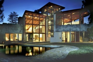
Industrial Look Exposed
Industrial interior design has been popular for some years now. When it comes to this trend, it’s all about exposed surfaces, rustic flooring, minimal colour palettes and bare-all light fixtures. This warehouse style finish can also incorporate other styles for a point of difference. Many high end apartments and homes use elements of industrial design by including vintage furniture and surfaces of stainless steel. When it comes to industrial light fixtures there are certain key elements to be aware of. In recent decades the light bulb has been seen by many designers as something to hide. In fact, Poul Henningsen, one of the most well known lighting designers spent his entire life’s work dedicated to designing pendant lamps that completely encased the light source inside them. It was his theory that no glare should ever be created by lights, and his designs reflected this principle. Industrial lighting designs don’t always completely go against this, but many do, seeing the globe itself as a sight to behold. This also gives a vintage vibe to these light fixtures that feature elements that hark back to the days of old. Blown glass pendants that encase the light bulb without concealing it provide a warm and nostalgic atmosphere in kitchens and living spaces. Experiment with different shapes and tinted glass pendant lights to bring a splash of vibrant colour to any room. For a more classic approach try industrial wire bulb cages. In tones of warm copper or modern black, these pendant lamps seem to embody the industrial style effortlessly. These bulb cages come in all different shapes and sizes, and while some are ideal for home interiors others have been specifically manufactured for use in cafes, restaurants and bars. It’s often the bulbs that make all of the difference here so choose something that’ll emit a warm, ambient light to compliment your home and create mood and atmosphere. Steer clear of bulbs with cool white tones and opt for warm white lights that emit an even glow across the room. For a more vintage feel compliment your raw industrial lighting with upcycled furniture accents and accessories to create an authentic industrial look that’s both inviting and edgy. Or if you want to emulate a more modern industrial feel look towards kitchen and living room elements that are reminiscent of commercial...
Kitchens That Get Better For Living In
The kitchen is the hub of the home and it is often the room we remember as being the place where we were nurtured as children, where we learned about family life and where we saw food prepared and brought to the table. The trend in kitchen design has been towards a streamlined look with high gloss cabinetry and granite work tops. Improvements in kitchen technology have given us: large deep drawers that close quietly with a gentle nudge plug sockets that pop up from work surfaces when required extractor fans that seem to hover in space, and surfaces that have ‘easy to clean’ written all over them I wonder if kitchens are becoming sterile and characterless? Have we gone a step too far and designed all the love out of them? When I met internationally famous kitchen designer Johnny Grey earlier this year he said that the kitchen has to be a friendly space, a place to be lived in where clutter is evidence of family life and where creativity should be encouraged. I found his words inspiring because I’m forever trying to tidy up and put away and keep work surfaces clear. His ideas inform his designs so that they contain ledges for putting things on, little round tables for kids to sit around, a corner here and there for a book or some papers and somewhere to perch and rest while the potatoes are boiling. You can have a modern design with simple lines and smart styling but you don’t need to remove visible signs of your family’s story. So, breathe easy, you can leave the kiddies drawings on the fridge and have the jar of coffee on view along with last night’s opened bottle of wine. In the design world we often describe certain materials as ‘forgiving’ and I think these kitchens are just that! Here are a few images I think to work well with this philosophy. They will still look good with crumbs on the work surface, finger marks on the doors, and scuffs on the floor, reminding me of this comment roundup from farmhouse kitchen experts. How do you rate your kitchen for...
Warm Things Up With Copper Tones This Winter
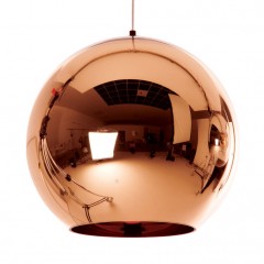
As the weather cools down, it’s time to warm up with glowing metallic tones. If we’re not wearing rose gold, we’re looking for lighting accents in copper for our homes. Without doubt, copper and rose gold have become popular choices for interior accents, lighting fixtures and fashion pieces in recent times. Looking specifically at copper, let’s talk about why the warmer of the shades has taken over in the metallic stakes. Copper has a natural, organic appeal, giving it a level of versatility some might dismiss at first. Take something like the replica Tom Dixon Copper Shade pendant lights. They’re not only classic in shape in style, but their highly reflective copper surface means that they compliment any room with ease. Copper can be paired with almost all neutral colour schemes and can add a level of vibrancy to plain, white interiors. If you really want to create the ‘wow’ factor in your home using copper, the Tom Dixon Etch Web pendant makes a real statement. While a single bulb positioned in the centre of the copper web, it throws light and shadow across all surrounding surfaces making it the ideal focal point for dining rooms and home interiors, especially those with high ceilings. While we are noticing a real lean towards copper pendants, there’s also a focus on copper wall lights, spot lights, table lamps and even garden lights. The copper obsession extends far beyond the home interior. While many home owners originally opted for black or silver outdoor lighting accents, copper is gradually making a very big comeback as a classic lighting colour/material fixture choice. And if you’re not sure how to decide between shiny or matt finish, bright or dull copper shades, mix and match. There are no hard and fast rules with this trend, you just need to play around with it and see what works for you. My only word of caution here would be to stick to a few key pieces so as to not overdo it. A table lamp, a cluster of pendants or a large copper planter can add that extra bit of warmth you’ve been looking for. Our love affair with rose gold and copper doesn’t seem to be coming to an end anytime soon. If you’re considering redecorating your abode, think about adding pieces that feature timeless warm metallic shades. Image Source:...
Unique Ideas for the Dreaded “Bonus Room”
One of the most puzzling aspects of the modern house construction and design industry is the concept of the Bonus Room. While the name is marketing genius, implying as it does all this extra room that you shouldn’t have expected, the fact is Bonus Rooms around the world are often more of a stress-inducing oddity than a true bonus. They’re often irregularly-shaped, located in areas of the home difficult to heat or cool effectively, and lack the necessary architectural aspects to be considered true bedrooms (like windows or wardrobes). There are standard responses to the Bonus Room Challenge: unofficial spare bedrooms, home offices, ‘media’ rooms, or playrooms. And if these ideas serve a function in your home, then they are perfect use for that oddball space in your house. If none of those fit the bill – or if they already exist elsewhere and you’re just duplicating to be able to say you’re ‘using’ your bonus space – try some of these unique concepts on for size. The Gallery Ideal For: The space on the second floor that’s really a very large landing. A few printed canvases and some cool furniture and your strange Bonus Room can be transformed into an extremely cool art gallery where your family’s holiday photos, portraits, or amateur photography can be displayed in a constantly-changing arrangement. Your children’s art can be scanned, sent off for printing, and hung with pride, and every house tour given to guests will make a stop in your own little gallery. Art on the walls, a nice but low-key couch and coffee table also make this a great spot for cocktails when the adults gather for an evening in. The Music Room Ideal For: The steamy finished attic space that leaves you breathless and hot. Attic Bonus Rooms are a cruel joke: Hot in the summer, cold in the winter, they’re so disconnected from the rest of the house there’s really nothing very ‘bonus’ about them. However, that very disconnection and lack of comfort means they’re ideal for the budding teenage musicians that every family eventually features. Keeping those guitars and drum sets away from the rest of the house might save your sanity, and if the music room slowly evolves into a general Sullen Teen Hangout space, that’s not so bad either. The Adult Getaway Ideal For: That windowless spare non-bedroom. That crazy extra room that looks like a bedroom but has no windows is a curious beast. While you can certainly stuff visiting family members and friends in there for a night, it feels cruel, and if you already have a spare bedroom it won’t get used often....
Concrete In Lighting Design
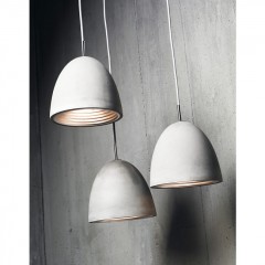
Concrete is not just the latest trend in flooring. It extends past designer kitchen bench tops and polished decorative planters. Concrete is now one of the most popular materials used by object and lighting designers and interiors decorators around the world. For homes that have an industrial edge, using concrete lighting just makes sense. If you want to exude a raw, industrial feel in your home you want to incorporate industrial materials into the overall design of your interior and lighting is one of the most important elements you need to consider. There’s no doubt that concrete and lighting make for a unique and unexpected pairing of which an Australian designer was the first to consider. Paul Mulhearn is the founding director and designer at Viore design. It was Viore who were the first in the marketplace to offer a range of concrete pendant lights. Coming in a range of three different sizes, plus a conical-shaped pendant, Viore’s original concrete pendants are ideally used in homes with high ceilings, where they can either be grouped together, spaced evenly or clustered over a dining area in different shapes, sizes and lengths. Each light features a beautifully textured concrete exterior with anodised silver interior and polished chrome finishing touches. The Australian lighting company, Viore continues to enjoy working with concrete as a medium and expects to continue to use it in the future with upcoming releases. These concrete pendant lights certainly have an organic, natural feel to them, which means they not only work well in industrial-inspired homes but also in minimalistic, Scandinavian-inspired and almost any home or apartment with a neutral colour palette. Because these concrete pendants have such timeless appeal, they make the perfect investment for redecorating home owners. Since learning more about the Viore Design concrete pendants, I’ve started noticing not only concrete lights, but concrete home wares and furniture items too. From side boards to chairs (I’m not sure how comfortable they’d be) to dining tables and even office desk accessories there’s really no limit to how concrete can be used. One things for sure, this trend of using concrete not only outside the home but inside too is not something that appears to be fading fast. If anything, I expect we’ll be seeing designers coming up with more ways to use concrete for a range of interior design projects for years to...
Being Mindful With Good Design
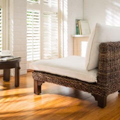
When is a chair not a chair? When it has a dual purpose. I first saw these beautifully crafted chairs when I lived in Canada and I had just started getting into meditation. They offer a comfortable spot to meditate, be mindful or just relax in. Meditation was like a blessing. I was working crazy hours in the oil industry and found meditation helped to ground me, even if it was just for short amounts of time. Relaxing, being at peace, slowing down and just being was helping my state of mind immensely. However, as everyone knows, when you have a busy schedule I found it hard to keep it up with the demands of everyday life. I found I needed to create a little oasis and needed a visual reminder to make sure I took time out for myself. While I meditated, I wasn’t a big fan of cushions on the floor or hard wooden surfaces. I like to be comfortable when I’m relaxing, so when I found this beautifully designed chair, which was also meant for meditation or just for generally chilling out, I jumped for joy. Fast forward a couple of years and my husband and I moved back to Australia to be closer to family. I was working on another business idea at the time, which didn’t work out, and then the chair popped back into my mind. I wanted to revive my meditation practice and to create my own little oasis. I got in touch with the designer to see if he could send a chair over to me but with the logistics of it he said no he couldn’t just send one. As a busy working mum I really needed that chair now, more than ever, so I ordered ten! As soon as I received the chairs my friends and family starting asking about them, and wanted to know where I had found them. I sold those ones in no time and that’s when my business idea came to fruition. The designer did not ship to Australia, so I would become the distributor here. I now import these chairs which are ethically made in Java, Indonesia. The bases are made of sustainable mango wood, with a seagrass and banana leaf weave, and the cushions are 100 per cent cotton and kapok filling. Since I started importing these beautiful pieces I’ve had CEOs of multinationals to Buddhist nuns; health practitioners to mums purchasing them and also conveying their yearning for a place of peace and solitude. I believe the benefits are huge, from spending just ten minutes a day listening to your breathing and...

