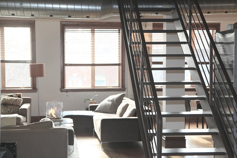
Interior Design can be a bit overwhelming, especially if you have no training or serious experience with it. In fact, for many people who choose to go DIY (or must do, due to budget constraints), their gut instinct is to reduce the project’s scale down to something more mentally manageable. This usually means focusing on one room of the house at a time – or, sometimes, just one aspect of a room. Once they get the scale down to something less frightening the ideas start to come.
The problem? This approach usually results in an over-designed home, or a home with a chaotic, rudderless design scheme that doesn’t feel cohesive. Beautiful, unique objects, textures, and colours won’t do much for your home if they fight with each other or don’t complement each other. Scary or not, the key to good design in the home is to think about the Big Picture.
The Problem
Here’s the problem: Whether you’re tackling each room as a whole separate project due to intimidation or budget, the end result is that each room feels like an island of design. On the one hand, this might make sense to you, because you’re pouring all of your creativity and resources into each space, so they will all emerge feeling “done,” with nice finishes.
And that may well be true. But if you step back and walk from space to space, think about whether the colour transitions from one wholly distinct palette to another are jarring, whether the decorations on the walls and surfaces tie into each other or not, and whether you feel like you’re walking through different people’s apartments instead of one family’s home.
In some cases, you want this distinction – giving a child his or her distinct space can be a great idea. But for the public areas of the home everything needs to feel like it’s part of a larger plan.

Image via pixabay.com
The Solution
The solution is simple: Step back and make sure there are visual “through lines” between each space. Take into consideration:
-
Colour Palette: You don’t need to use the same colour palette in each room, but each colour palette should launch from the same starting point and complement each other. One great idea is to have each room shift from one end of the palette spectrum to another as you move from the front to the back of the home.
-
Wall Art: Each piece of wall art should refer back to others in the home. Subtlety is key. Different styles of canvas prints or other wall decor all depicting similar subjects, or canvas prints made from the same photo set you took on holidays but filtered differently to accentuate different hues, can tie everything together.
-
Materials. Think in terms of families of textures. If you use gold accents in one room, continue the metallic theme in another.
The key isn’t to have every room feel like it was done in the same way – but to foster the subtle sense that each room is part of a larger whole, and ties into the others. The final hint?
Just because you have an all-house plan for renovation and design doesn’t mean you have to implement it all at once. Tackle it room by room, by all means, as budget and time allows. Just start off with a comprehensive vision.
- Top-Five Farm Gate Signs Ideas - August 17, 2022
- 7 Benefits of Engineered Wood Flooring - January 27, 2022
- How Smart Homes are Impacting the Interior Design Industry - January 10, 2022


